As digital products grow, visual consistency becomes harder to maintain. A button that one team built looks slightly different from a button another team built six months later. The spacing is inconsistent between features. The typography rules are not written down anywhere so each developer makes their own decisions. The product starts to look like it was assembled from parts.
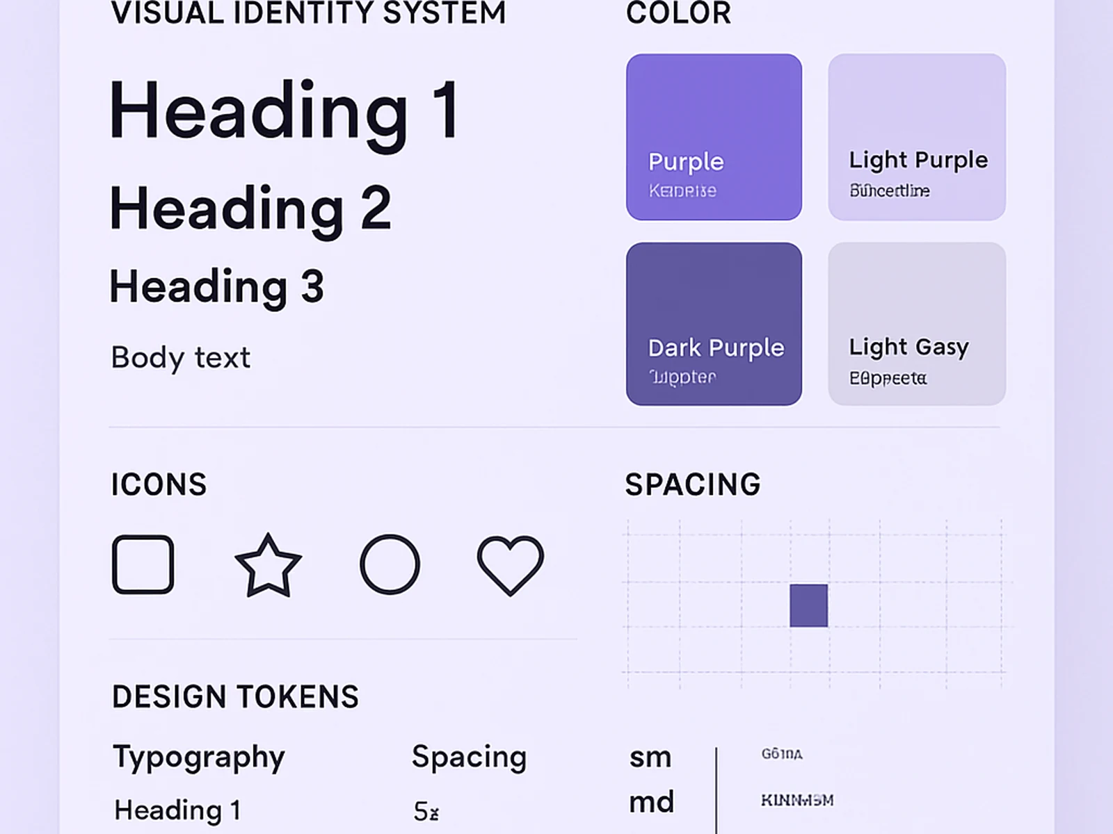
A visual identity system defines the decisions that should not be made individually: colours, typography, spacing, elevation, component specifications. When the system is in place, teams build faster because the small decisions are already made, and the product looks like a single coherent thing regardless of who built which feature.
We build visual identity systems in Figma using variables, auto-layout, and component properties. Every component is built to the same standard and documented so that any designer who joins the team can use the system immediately without a long onboarding process.
For organisations that already have a product but no system, we start with an audit. We catalogue what exists, identify what is inconsistent, and produce a consolidation plan. Sometimes that means rebuilding from scratch. Sometimes it means extending and documenting what already works.
What is included
What a client says
"New features ship faster because the design decisions are already made. The system paid for itself within the first quarter."